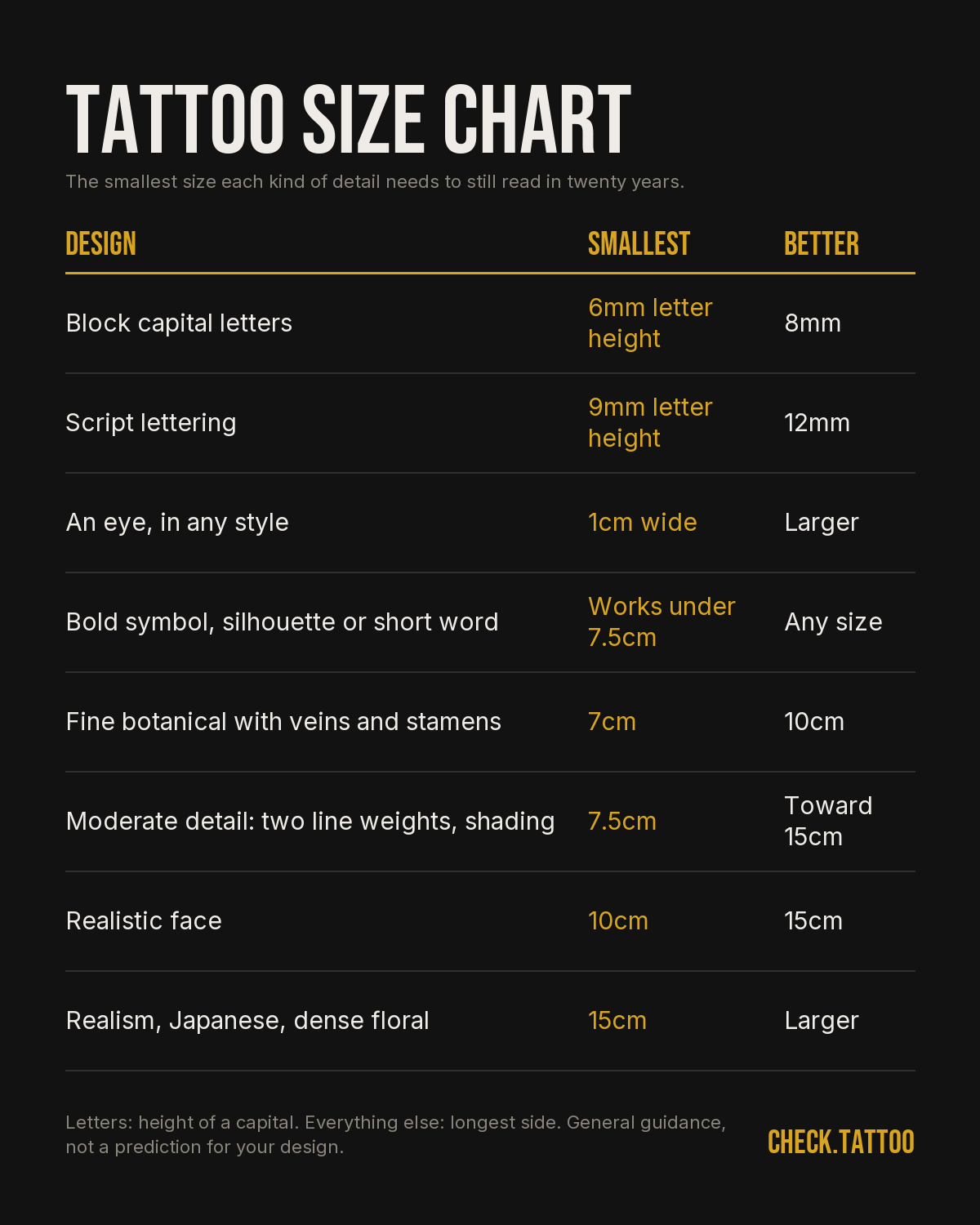
THE MISTAKE THAT COSTS THE MOST
Ask any artist which sizing error they see most and the answer never changes. Too much detail squeezed into too little skin. It is almost never a bad drawing. It is a good drawing at the wrong scale. Pew Research Center reported in 2023 that nearly one in four US adults with a tattoo regrets at least one of them. Sit in a shop long enough and you notice how often that regret is not about the subject at all. People still love the peony. They simply cannot see the peony anymore, because at 4cm the petals, the stamens and the shading all ended up living in the same two millimetres of skin. Skin is not paper. Ink settles and spreads a little in every direction for as long as you have it, and everything you drew close together gets closer. The fix costs nothing at the sketch stage: go up a size, or take detail out. The same fix costs a cover-up or a laser course at year seven. Size is the cheapest variable you control, and it is the one people argue hardest against.
WHY IT LOOKS PERFECT ON A SCREEN AND FAILS AT 4CM
You are judging the design at 15 or 20cm across, backlit, held 30cm from your face, on a surface that holds a line one pixel wide forever and never moves. Your forearm is none of those things. It is matte, it curves away from your eye, it is usually seen from a metre or more, and it is alive. Three things happen when the file becomes a tattoo. The design shrinks, often to a third of what you were looking at. Contrast drops, because black ink under skin reads as a soft charcoal, not the pure black of a monitor. And the smallest marks stop being marks and become texture. Before you fall in love with a reference image, print it at the exact size you plan to get it. Not scaled to fit the page. Actual measured millimetres. Most people are quietly shocked. The version on your phone is a poster. The version on your arm is a stamp, and the stamp has to carry the same idea.
LINE WEIGHT AND SPACING SET THE FLOOR ON SIZE
Size is not really a decision about size. It is a decision about line weight, and line weight decides everything else. A single needle lays a line roughly a third of a millimetre wide. A standard three round liner sits nearer three quarters of a millimetre. A bold traditional outline runs a millimetre or more. Whatever the artist lays down, it will not stay that width for twenty years, and the softening is roughly the same absolute amount whether the line started thin or thick. That is why a bold line loses a small percentage of its crispness and a hairline loses its identity. The practical rule artists work to is spacing, not thickness. Leave a gap between two lines at least as wide as the lines themselves, and ideally one and a half to two times as wide. Any two marks sitting closer than about a millimetre are candidates to merge into one over time. Once you know the thinnest line your design needs and the tightest gap it contains, the minimum size is arithmetic, not taste.
HOW MUCH DETAIL SURVIVES PER SQUARE INCH
The useful discipline is counting separate decisions per square inch of skin. A handful of distinct elements in a square inch will still read as distinct elements in twenty years. Pack in two or three times that many and the smallest ones start to merge with their neighbours. Push to fifteen and you get a grey shape with a suggestion of structure. Count honestly: an eye is not one element, it is a pupil, an iris, a lid line and a catchlight. Two ways to test it now. Squint at the design until it blurs, and see whether the silhouette still tells you what it is. Then shrink the image on your screen until it is the real finished size, stand back two metres and look again. Whatever disappears at two metres is detail you are paying for and will not keep. Running the idea through the free check on check.tattoo is useful here mainly because it forces the same question in writing: at this size, on this spot, which parts of this design are carrying the meaning, and which are just decoration that will close up.
LETTERING AND SCRIPT: THE REAL MINIMUMS
Text is where small sizing fails fastest, because letters have no silhouette to fall back on. For clean block or sans-serif capitals, treat 6mm, about a quarter inch, as the floor for cap height, and be happier at 8mm. Script needs more, usually 9 to 12mm, because the whole character of script lives in the hairline strokes connecting the thick ones, and those hairlines are the first thing to soften. Serifs, thin ligatures and swashes need more again. Then count characters. A single word of eight letters at 8mm cap height is already 5 to 6cm of horizontal run, longer in script. A full name, a date and a line of a poem will not fit on an inner wrist at a size that survives. Non-Latin scripts and anything carrying diacritics, vowel points or tone marks need extra room, because the marks that change the meaning are the smallest strokes on the page. If the text is a memorial, size it so that in thirty years you can still read it aloud to someone.
FACES, ANIMALS AND ANYTHING WITH EYES
A single human face in realism wants 10 to 13cm, 4 to 5 inches, from chin to hairline as a minimum, and black and grey realism is generally happier at 15cm and above. The reason is not artistic ambition, it is anatomy at scale. Likeness lives in the eye socket, the corner of the mouth and the transitions of the cheek, and those need enough millimetres to hold a real gradient rather than three flat greys. An eye needs roughly 1cm of width before pupil, iris, lid and catchlight can coexist without merging. Animals follow the same rule. A wolf head that reads beautifully at 20cm becomes a dark triangle at 7cm, because the fur that gave it form collapses into a solid. If you want a portrait and the space is small, the honest move is not to shrink it but to change approach: a bolder, more graphic interpretation with fewer tones will hold. Portraits of people you have lost deserve the size, and deserve an artist who specialises in them.
FINE BOTANICAL WORK, DOTWORK AND GEOMETRY
Fine botanical illustration is the most commonly undersized style there is. A sprig with leaf veins, stamens and a tapering stem wants 7 to 10cm before those three things stay separate, and the stem is the tell: if the drawing asks for a line thinner than the artist's thinnest needle, the design has already failed at that size. Simplify the branch, keep the outline, drop the veins, and it works small. Dotwork has its own floor. Individual dots need clear air between them to stay dots, so stippled gradients need surface area to breathe, and a mandala's failure point is always the innermost ring where the geometry gets tightest. Good mandalas leave the centre open for exactly that reason. Pure geometric line work is the most forgiving thing you can get. Clean, evenly weighted lines with generous spacing scale up and down well and age well, which is why they work on wrists and ankles where botanical realism does not. Style is not just look. It is the size the look requires.
SMALL TATTOOS: UNDER 7.5CM (3 INCHES)
Small works beautifully when the design is built for it. That means simple, bold, high contrast: clean single-weight lines, solid fills, one clear idea, and generous negative space inside the shape. Think a symbol, a small animal in silhouette, a simple flower with four or five strokes, a short word. Ideal placements are the wrist, forearm, behind the ear, the ankle and the back of the shoulder. What does not work at this size is exactly what people most often ask for at this size: detailed portraits, complex scenes, dense stippling and tiny lettering. Fingers and the sides of hands deserve their own warning, because the skin there sheds and moves constantly and small designs on them blur faster than anywhere else on the body. Apply the arm's length test. Hold the printed design at the distance a stranger would see it, and if you cannot tell what it is, the design is too detailed for the size, not too small for the design. Reduce the detail or raise the size. Do not do neither.
MEDIUM TATTOOS: 7.5 TO 15CM (3 TO 6 INCHES)
This is the range most first tattoos land in, and for good reason. It is large enough for real detail and small enough to sit proportionately on a forearm, a calf, an upper arm or a shoulder blade without demanding a plan for the rest of the limb. At this size you can carry moderate complexity: two line weights, simple shading with genuine mid-tones, a limited palette, readable lettering, a flower with actual structure, a small animal with fur direction rather than a silhouette. It is also the range where you get a healed result close to what you imagined, because the drawing has enough room that a millimetre of settling does not change what the thing is. If you are hesitating between a small version and a medium version of the same design, medium is almost always the answer that gets defended in ten years. The extra area costs one more hour in the chair and buys you the detail that made you want the design in the first place.
LARGE TATTOOS: 15CM (6 INCHES) AND UP
Large is where the demanding styles finally work as intended. Realism, Japanese traditional, biomechanical, dense floral compositions and elaborate geometry all need room for graduated shading, layered elements and proper negative space between them. The back, chest, thigh, ribs and full sleeve panels are the natural homes. What changes at this size is that you are no longer designing an image, you are designing a composition on a moving body. It has to read as a whole from three metres away, hold interesting detail up close, and follow the muscle rather than fight it. Large work also ages the most gracefully, because the artist can build in the spacing that decades will eat into. The tradeoffs are real. It costs more, it takes multiple sessions, some areas hurt considerably more than a forearm, and it commits a region of your body to a direction. That is a reason to plan it properly with an artist who works in that style, not a reason to shrink it into a size where it cannot succeed.
SIZE, PLACEMENT AND THE CURVE OF THE BODY
A flat design lands on a curved surface, and the curve eats width. On a cylindrical limb you never see more than half the surface from any one angle, and the outer edges are foreshortened even then, so a design measured flat at 12cm across a forearm compresses at the sides and its outer thirds stay effectively hidden until you rotate your arm. Tall and narrow suits limbs. Wide and square suits the back, chest and thigh. Curvature also affects the design itself, since a straight line drawn across a bicep will look bowed on skin and a circle placed over the shoulder cap will read as an oval. Good artists compensate in the stencil, which is one reason the stencil placement session matters as much as the drawing. Then there is movement. Skin over the elbow, knee, inner wrist, ribs and hip stretches and folds daily, and tight detail there closes up faster. Leave a margin between the design and the natural frame of the limb rather than filling edge to edge, and the piece will look intentional for decades.
WHAT SIZE DOES TO PRICE AND SESSION COUNT
Area grows with the square of the dimension. Doubling a design from 7.5cm to 15cm does not double the work, it roughly quadruples the surface to be covered, and that is the single fact that explains most tattoo quotes. Most shops charge either by the hour or by the piece, with a shop minimum that covers the setup, sterile supplies and time regardless of how tiny the design is. That minimum is why a very small tattoo often feels expensive per square centimetre, and why adding size to a small piece is usually cheaper per centimetre than you expect. Density costs more than area, too. An hour of tight stippling is slower than an hour of solid fill, so two designs of identical size can be quoted very differently. Sessions follow the same logic. Many artists keep a first sitting to three or four hours, since skin and nerves both stop cooperating after that, so anything past roughly a large forearm panel becomes a multi-session plan. Budget for the size that works, then book the sessions it needs.
SCALING AN IDEA UP WITHOUT RUINING THE COMPOSITION
Enlarging a design is not the same as multiplying every number by 1.5. Line weight and spacing usually should not scale proportionally, because a line that looks delicate at 8cm can look clumsy at 20cm, and a gap that felt generous can turn into an empty gulf. What normally happens when a good artist scales a piece up is that the outline weight increases modestly, internal detail gets added rather than stretched, and the negative space gets rebalanced so the composition still has a clear focal point. Scaling down is harder and more brutal, because it means deleting elements, not thinning them. Two other things to watch. Aspect ratio should follow the body part, so a design widened to fill a thigh may need its whole layout rethought rather than stretched. And text almost never scales with the image, since lettering has its own legibility floor and often ends up proportionally larger than the original sketch. Ask your artist to redraw at final size rather than resize, and expect the redraw to look slightly different. That is the work being done correctly.
HOW TO TEST THE SIZE ON YOUR OWN BODY FIRST
Do this before the appointment, not in the chair. Print the design at exactly the intended dimensions, cut it out along the outline, and tape it where it will live. Then leave it there for two days. Look at it in the mirror, in daylight, under bad bathroom lighting, and in a photo taken from a metre and a half away, which is roughly how everyone else will ever see it. Bend the joint. Sit down and check what the ribs or hip do to it. Squint at your own reflection and see whether the shape still reads. Try a second printout one size up and compare, because almost everyone who does this ends up choosing the larger one. The on-body preview at check.tattoo does the same job digitally on your own photo and is faster for comparing three sizes side by side, though it is a prediction and a second opinion rather than a promise about your skin. Bring both the printouts and your questions to the artist. That conversation is the whole point.